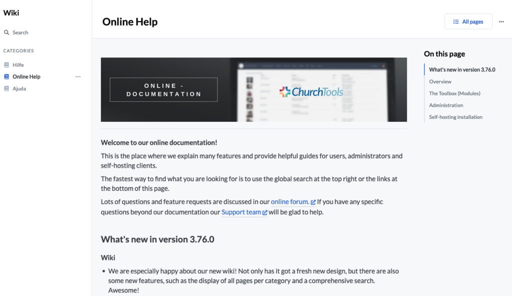
After a long time, our wiki has now received a facelift and shines in new glamour. After David had gone through the revision of the wiki APIs in his spare time at the end of last year, I set about using these APIs in January. A first prototype was created and discussed and revised internally. As Wiki 2.0 slowly took shape, it was then officially scheduled into our “sprint”. In the end, the module was almost completely rewritten and contains not only improvements to the user interface and operation, but also a few new features. Here I will give you a brief overview of the changes and innovations that have made it into Wiki 2.0.
Layout and Design
We have adapted the design to our new standards, which you already know from Finance and the Admin Settings. Thereby also the contents of the wiki have been relaunched:
- In the left sidebar you can find the categories including the master data.
- Wiki pages can be created from the menu without having to be linked.
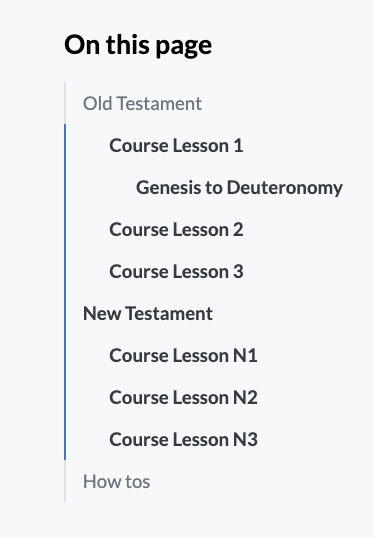
- On the right there is now the table of contents of the current page.
- The search has got its own page.
- The editing functions and context menus have moved to the top of the page.
The new page structure has also enabled the content to be better prepared for mobile devices: The sidebars on the left and right fold in and can be opened via buttons in the page header, so that good navigation within the wiki is also ensured on smartphones.
The content elements of the wiki pages have also been completely revised and aligned with each other. Thus, among other things, the proportions of headings to the text are now much better and fit better into the overall picture.
URLs & the table of contents
The format of our URLs for the wiki has also changed a bit, making them more readable. Now also the browser history with back and forward buttons can be used properly and these links can also be shared better in emails or similar.
Before: ?q=churchwiki#WikiView/filterWikicategory_id:0/doc:main/
After:
wiki/0/main
Another hierarchy level has been added to the table of contents and is now automatically composed and filled from headings 1-3. The links in the table of contents are so-called anchor links, which ensure that the wiki automatically scrolls to the correct section. These anchor links are also mapped in the URL and can be easily shared with (wiki/0/main#Module).
Search & Overview
The cross-category search is here! Now you have the choice whether you want to search for a term only in one category or across all categories. Both are possible in order to get to the desired search result as quickly as possible.
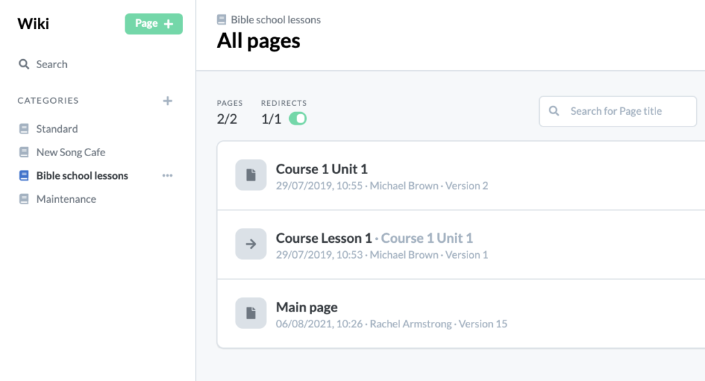
In addition, there is now a listing of all pages of a category. Thus, no page is lost anymore, you can get an overview, as an editor you can perhaps clean up again and reach individual pages even without linking to other pages. The list is next to the title, sortable by “Last edited” and “Number of versions”, each ascending and descending. In addition, a distinction can be made between wiki pages and redirects. The list also directly provides the option to convert a page to Markdown, more about this in the next section.
Markdown
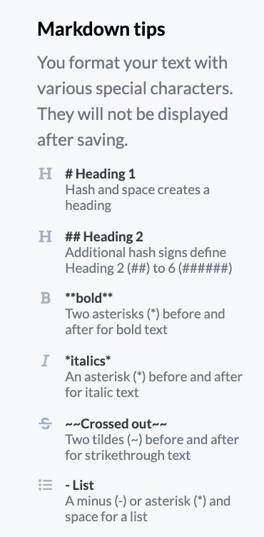
With the new wiki, we have changed the preferred format of a wiki page to “Markdown“. With the new wiki we have changed the preferred format of a wiki page to “Markdown”. This results in some changes, but: previous wiki pages in HTML still work and are in some cases partly better suited. In general I would recommend you to convert your pages to Markdown as far as possible. Why “as far as possible”? Markdown is more limited in its presentation than HTML (e.g. there is no colored text or markup), but it can be used in a much wider range of ways.
Convert old wiki pages to Markdown
So you do not have to completely reformat your old wiki pages, there is the possibility to convert the previous HTML content to Markdown. Here you can see the old and new content in two windows side by side and can check them for display errors and then save them. The converter is a bit more strict about this and deletes various formattings from HTML that do not exist in Markdown. So if you want to keep these formattings, you either have to be satisfied with what Markdown provides or stay with HTML.
If you find out after the conversion that something went wrong and you are missing content or the format doesn’t fit after all, you can easily restore an older version via the version window in the context menu.
Advantages of using Markdown
Images can be inserted in the new Markdown-Editor via copy & paste or directly from the clipboard. They are also set directly to “Only visible with write permission”. This way the file list is not filled with redundant files for the reader. Who uploads images via this functionality can change the output size of the image via changing the URL parameter w=940.
With app version 0.23.0, the wiki can also be found in the search under Discover (until now, only the search for the title was possible here). Both Markdown and HTML pages are displayed here. In terms of display, however, the Markdown pages are better and more consistent and should be preferred.
Files & Links

The table for files and links was of course also revised and improved. Here the sorting is now by default the upload date and all information is searchable. Images have a small preview directly and audio & video files can still be played directly in the browser.
When you are in edit mode of a page, you are also offered small code snippets to easily embed a file directly into the text. You will also be warned if a file is still used in the text when you delete it.
Categories & Administration
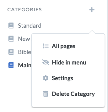
The administration of the wiki’s master data now appears directly in the context menu for each wiki category. Here, for example, categories can also be hidden or shown directly in the menu. Hidden categories can be found at the end of the list to save space for those with editing rights.
More functions
Better handling: Links in a wiki page are marked with different icons and colors if you have the right to edit the page. For example, links to empty pages are highlighted in red or external links are supplemented with an arrow icon.
Default saving: Caching already existed in the old wiki, but has been enhanced for the new one and now only saves drafts of a page for a maximum of seven days and also shows the elapsed time since the last edit when called up, so that you can better determine whether the draft should be restored.
Print view: The print CSS has been completely revised, so that a printed page now takes over less unimportant elements. In addition, links are now also printed with the entire URL.
Edit mode: Before starting the edit mode of a page, the page is reloaded in the background in order to get the latest changes and not to edit a meanwhile old version.
We hope you are as excited about Wiki 2.0 as we are. If you have any questions, ideas or suggestions on how to make it even better, our forum is just the place for that feedback. And now happy converting and Markdown writing.
One comment
Comments are closed.