The app is progressing. Meanwhile version 0.11 has been released in the stores and I would like to give you a short overview of what has happened since the last post.
Groups on the start page [v0.9.0, v0.11.0]
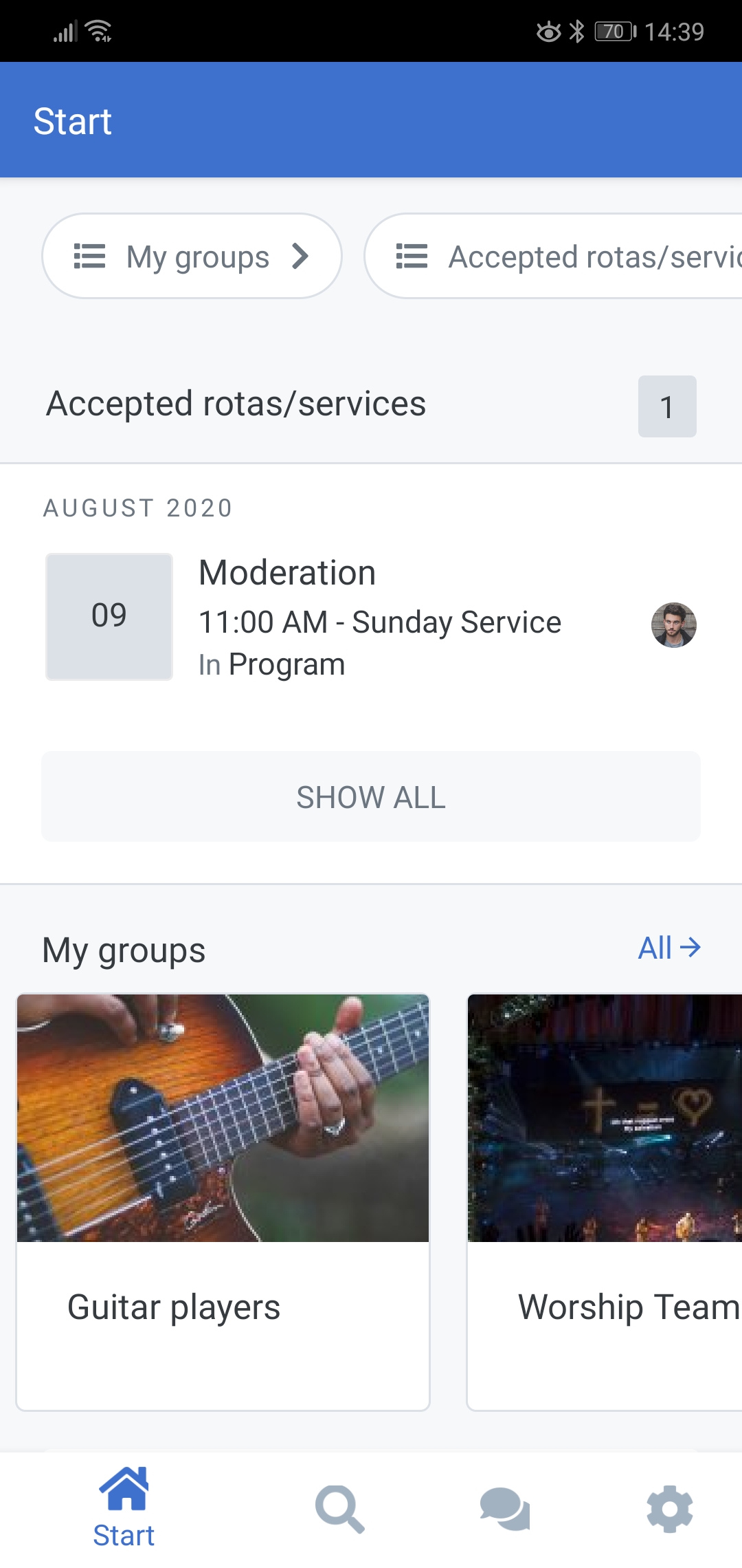
We have now added My Groups on the start page. This gives you quick access to your groups and makes it even easier to find what you are looking for.
In the preview on the start page 10 groups are listed. But with the button “Show all” you can easily get the whole list.
From Search to Discover [v0.9.0, v0.10.0].
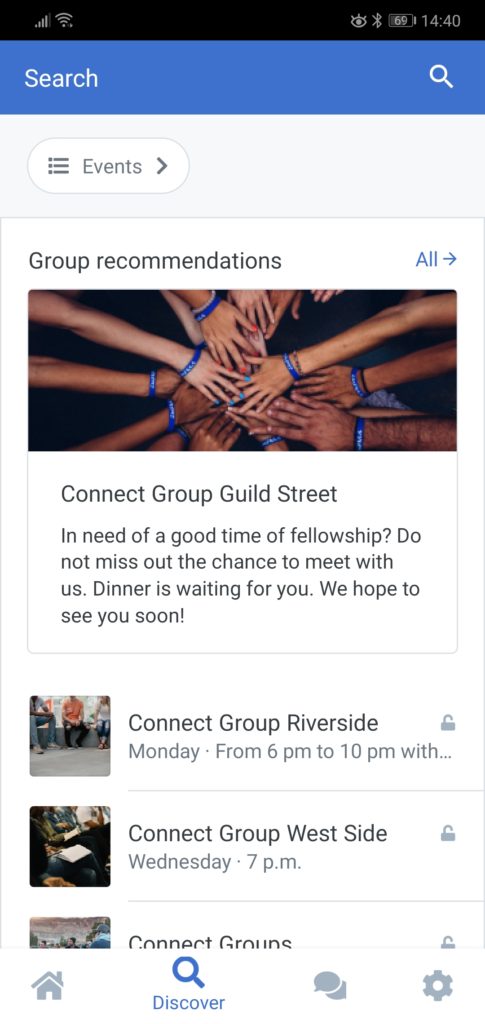
In the first versions we have built in a simple search. This search still exists, but we have adapted the tab and created a Discover page. Under Discover you can now find group suggestions to which you can subscribe.
Underneath, you will now find the individual groups that can be viewed, sorted by group type. So if you can’t find the group you’re looking for under My Groups on the start page, you’ll find it here.
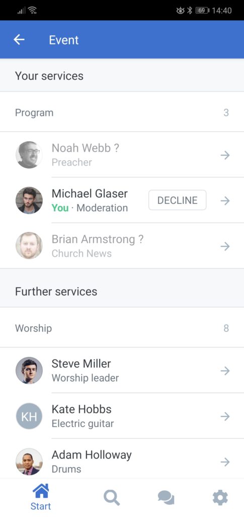
At the upper edge you will also find an event chip. It shows the events of the next 2 months, even if you are not part of the event. So the planner always has an overview and knows who is scheduled to attend the event and when.
Accessing ChurchTools Web [v0.9.0]
We are constantly working on improving the app and with every version new features are added. Until your desired feature is finally available in the app, we have included a small shortcut to the ChurchTools Web.
Via the settings page you can now tap on the web view of ChurchTools. Since the app already knows who you are, you don’t need to log in, you are already logged in and can start right away. So all functions of ChurchTools are available on your mobile phone.
List layout revised [v0.11.0]
With every new version new features are added, but also visual changes can be observed here and there. Often it takes some time of use before you realize if a design is good or not. For instance, we have revised the list view.
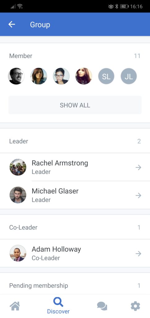
Information has moved closer together and unnecessary whitespace (space without information) has given way. So we can get more information on the screen and it is also more comfortable for the eye, because anchor points are better chosen.
We have also added a counter to show how many entries, e.g. people, are listed in this section and if there are too many, everything will be collapsed. Because who needs to see all 200 group members at once. 😉
There’s been a lot more. You are welcome to leave your questions and criticism in the forum. There, many ChurchTools users discuss and exchange valuable user stories. So it is definitely worth a look.


