Summer is in full swing, the highways are well filled and ChurchTools releases version 3.89. If that’s not summer feeling, I don’t know what is. 😎 Together with the new version, we also release our newest product: ChurchTools Website. 🌍
ChurchTools Website
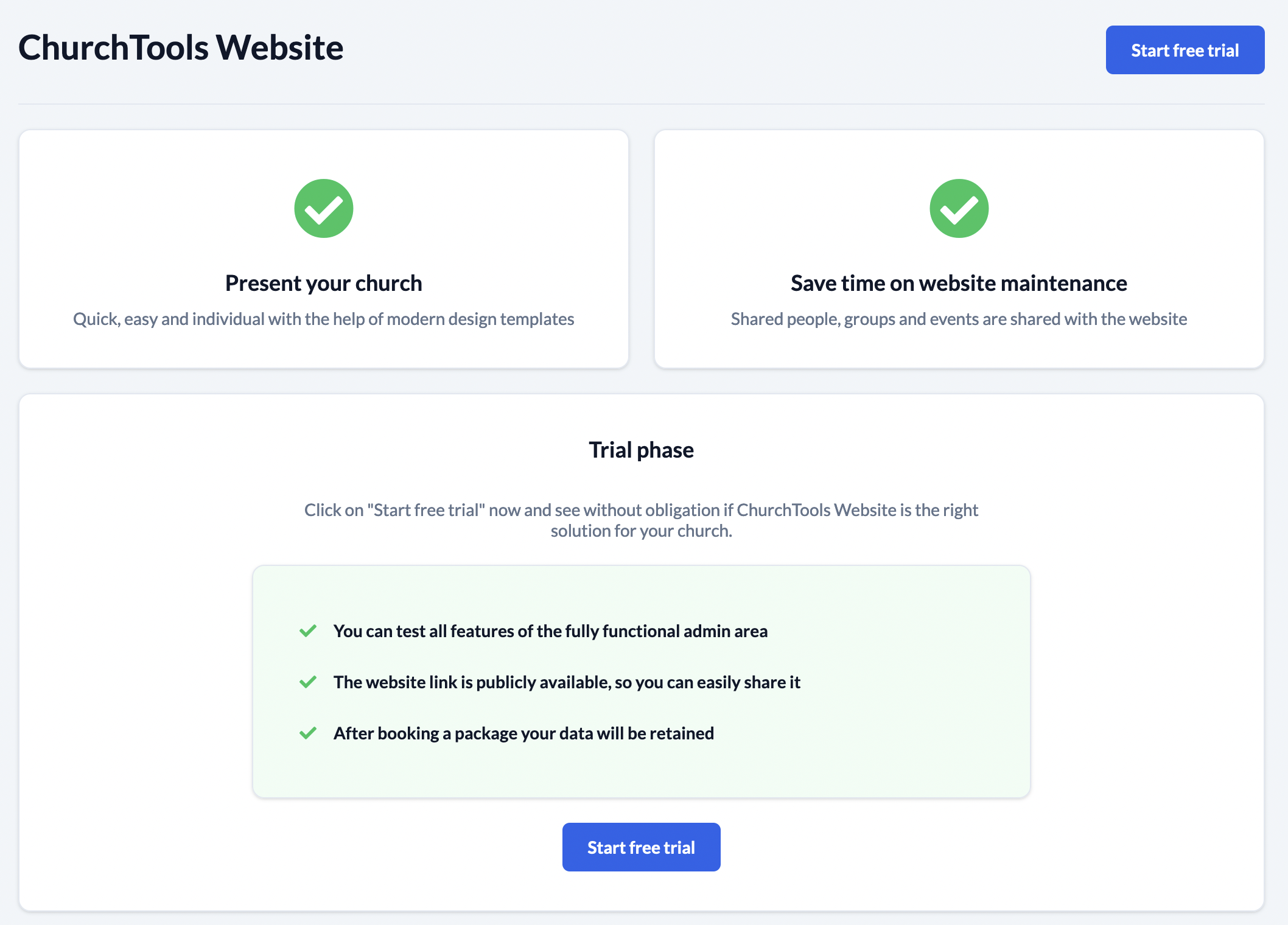
We go live with ChurchTools website. On 23rd of August 2022, the time has finally come. We’re so excited about it that we’ve planned an extra blog post and live event on YouTube (in German) for it.
You can create a ChurchTools website directly in ChurchTools in the Public Relation module and start editing it right away.
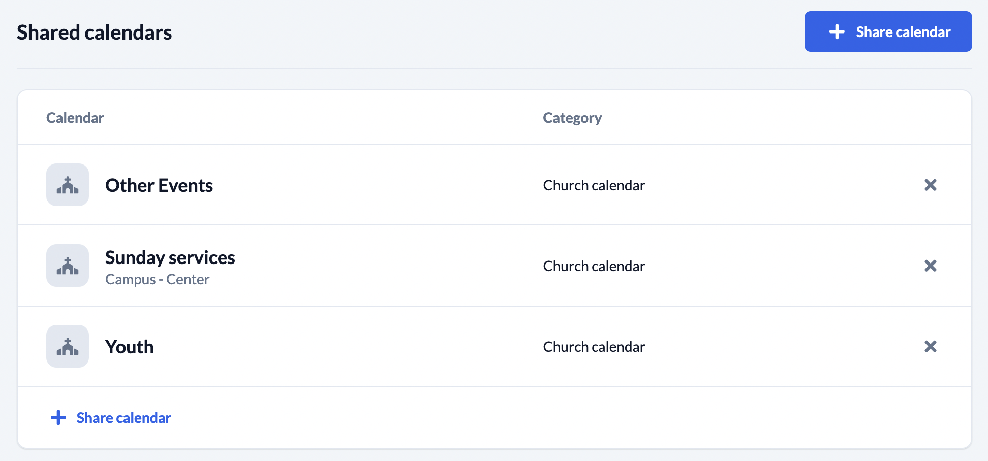
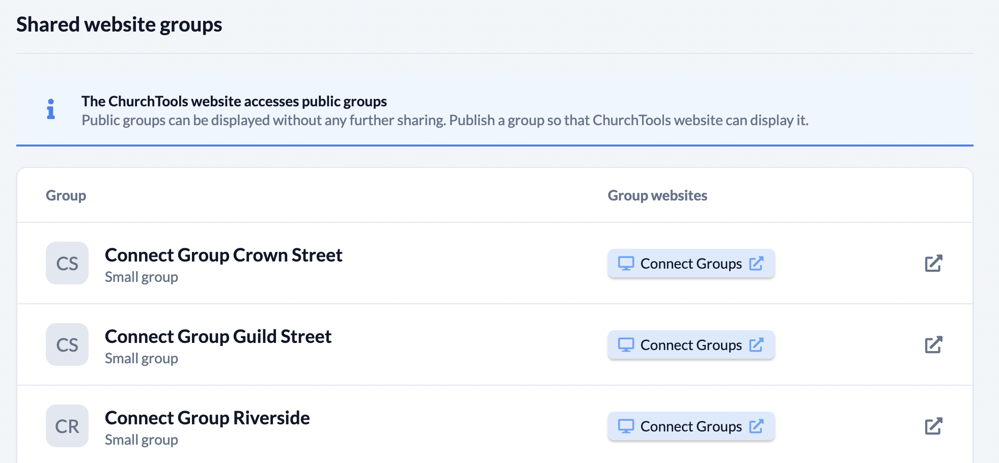
There you can also set which people, groups or appointment calendars should be synchronized with the website. This way the data is always up-to-date and if responsibilities or appointments change in ChurchTools, it is directly reflected on the website.
Translation: Authorize Editing of Languages
Did you know that ChurchTools is translated by many volunteers? This means that ChurchTools is available in German, English, Portuguese, Spanish, Finnish, Dutch and French, among others. More languages are added regularly, and we would like to take this opportunity to thank all our volunteers once again. 👏
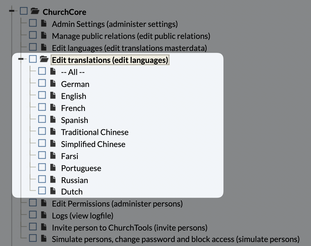
But also some congregations use their own translations to adapt ChurchTools to their needs. With version 3.89, individual languages can now be authorized separately. This means that different translators are then only allowed to translate the respective language. However, they can still read all translations of the other languages as well. Because sometimes exactly this is helpful to find the right translation.
Automatic Focus in Dialogs
The next three topics belong to the category of UI/UX improvements. In other words, changes in the design or behavior of the software to make it more user-friendly and appealing. Because it’s often the little things that make the experience complete.
Among other things, as of version 3.89, the fields in various dialogs are now automatically focused. This means that you need one click less, your hands can stay on the keyboard and the workflow is not interrupted.
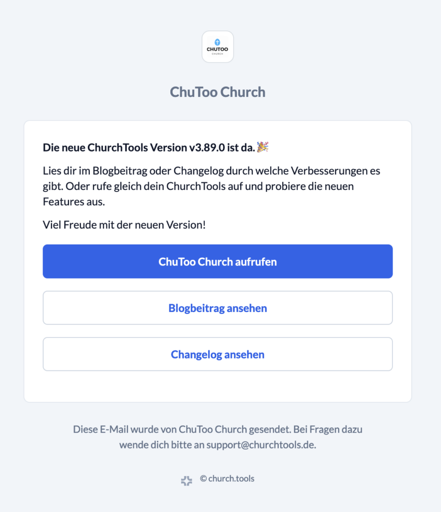
New Email Design
Secondly, we have embellished the mails that ChurchTools sends. The design has been adjusted a bit and therefore looks tidier and more contemporary.
Call-to-actions, i.e. actions that the reader is supposed to do, also come into even better focus and will hopefully not be overlooked and carried out.
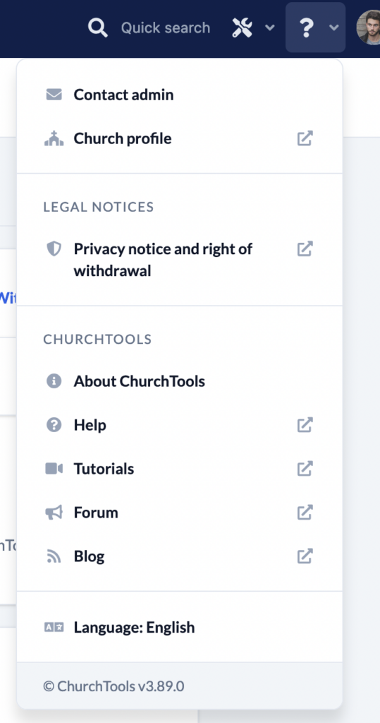
?-Menu Restructured
The ?-menu in the main menu bar has been restructured. Things that belong together now appear together. Additionally, a link to the own Finder profile and to the website is listed here, if they are used.
Also some helps like the help pages, tutorials, forum and blog are neatly listed under in the menu.
Further changes
If this is not enough for you, you will find all changes of this and earlier versions in our Changelog.
We hope you like the new version as much as we do. As always, you may leave praise and criticism in our forum.

